Navigating the UI
This page covers the main areas of the MythTapestry interface so you can orient yourself quickly.
Dashboard
Section titled “Dashboard”After logging in you land on the Dashboard. From here you can:
- View and manage all your worlds
- Create a new world
- Access your profile, AI model preferences, and subscription settings
Top navigation bar
Section titled “Top navigation bar”The dashboard top bar is always visible and contains:
| Item | Description |
|---|---|
| MythTapestry logo | Click to return to the dashboard home |
| Theme switcher | Toggle between light, dark, and system themes |
| Docs | Opens these documentation pages in a new tab |
| Discord | Join the MythTapestry community for feedback, discussion, and support |
| Feedback | Opens a GitHub issue to report bugs or request features |
| Profile | Your account settings, AI preferences, and API key management |
| Sign Out | Log out of your account |
On mobile, these items are accessible from the hamburger menu.
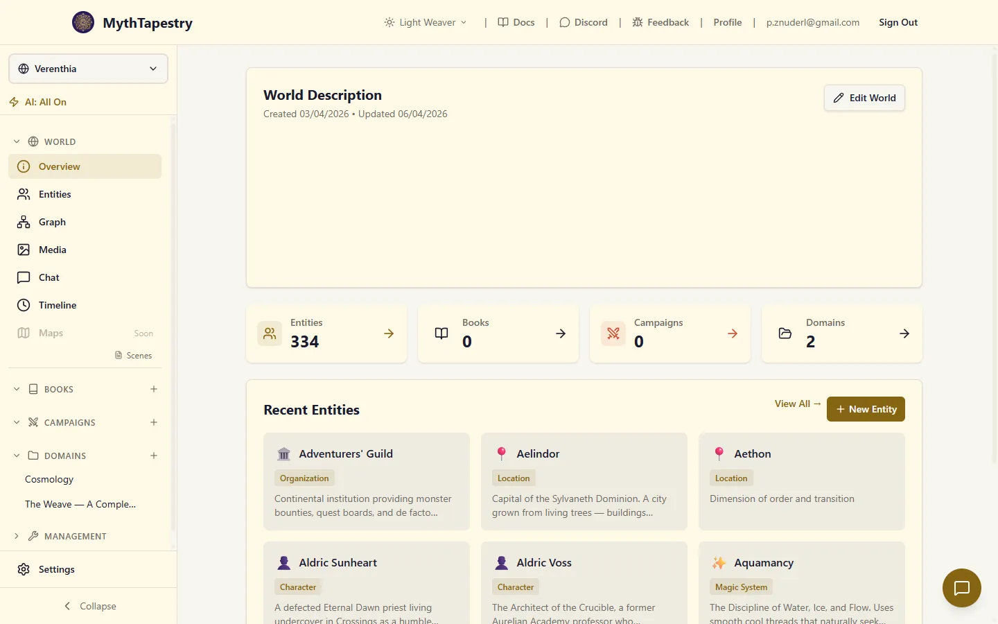
World view
Section titled “World view”Once you enter a world, the layout changes to a sidebar + main content arrangement. The sidebar has three fixed zones so you always know where you are and can access key settings without scrolling.
Sidebar structure
Section titled “Sidebar structure”The sidebar is divided into three zones:
┌─────────────────────────┐│ World Switcher │ ← Always visible (sticky top)│ AI Status Indicator │├─────────────────────────┤│ World section ││ Container sections │ ← Scrollable middle│ Management section │├─────────────────────────┤│ Settings │ ← Always visible (sticky bottom)│ Collapse toggle │└─────────────────────────┘Sticky top — The world switcher and AI status indicator are always visible, even when the sidebar has many items. You always know which world you’re in and whether AI features are active.
Scrollable middle — All navigation sections scroll independently. As your world grows with more books, campaigns, and content, only this zone scrolls. At its top sits the “Viewing as of” time selector — normally Viewing: Live — which lets you view your whole world as it stood at any past moment. See Viewing Your World in Time.
Sticky bottom — Settings and the collapse toggle are always one click away.
World switcher
Section titled “World switcher”The world switcher at the top of the sidebar shows the name of your current world. Click it to:
- Switch to a different world
- Navigate to the worlds list to create a new world
AI status indicator
Section titled “AI status indicator”Directly below the world switcher, the AI status indicator shows at a glance whether AI features are enabled for this world.
| State | Display | Meaning |
|---|---|---|
| All off | ⚡ AI: Off (amber) | No AI features are enabled — the default for new worlds |
| Some on | ⚡ AI: 2/4 | Some features are enabled |
| All on | ⚡ AI: All On (green) | All AI features are active |
When all features are off, a subtle “Enable in Settings →” hint appears to guide you.
Click the indicator to open a popover showing each feature’s status:
- Entity Detection — Detects entity mentions in your writing
- AI Extraction — Uses AI (instead of local GLiNER) for more accurate detection
- Relationship AI — Suggests relationships between entities based on your content
- Chat Widget — Shows a floating chat bubble for quick AI conversations
The popover includes a direct link to Configure AI Settings, which takes you to the World Settings page.
When the sidebar is collapsed to icon-only mode, the AI indicator shows just the ⚡ icon, color-coded to match the current state. The same popover appears when you click it.
Sidebar sections
Section titled “Sidebar sections”The scrollable middle of the sidebar contains these sections:
The core navigation for your world’s data.
| Item | Description |
|---|---|
| Overview | World summary with stats, recent activity, and quick links |
| Entities | Browse, search, and manage all entities (characters, locations, items, etc.) |
| Graph | Interactive knowledge graph showing entities and their relationships |
| Media | Image gallery for your world’s visual assets |
| Chat | Full-page AI chatbot with session management — ask questions about your world |
| Timeline | Multi-entity tracks view for comparing lifespans, relationships, and world events on a shared time axis (details) |
| Maps | Spatial maps with entity placement (coming soon) |
Container sections (Books, Campaigns, Encyclopedia)
Section titled “Container sections (Books, Campaigns, Encyclopedia)”Each root container type gets its own collapsible section. The default types are:
| Section | Purpose |
|---|---|
| Books | Novels and stories — contains chapters, which contain scenes |
| Campaigns | TTRPG campaigns — contains sessions, which contain segments |
| Encyclopedia | Knowledge domains — contains articles |
Each section shows its containers as a tree. You can expand containers to see their children and content units. A + button on each container lets you quickly create new child items.
Management
Section titled “Management”Tools for managing your world’s type system and metadata.
| Item | Description |
|---|---|
| Entity Types | Configure which entity types are available and their subtypes |
| Relationship Types | Browse and manage the relationship type catalog |
| Bulk Relationships | Create many relationships at once between entities |
| Content Types | Configure content unit types (scenes, segments, articles) |
| Calendars | Create and manage custom calendar systems |
| Date References | View all temporal references extracted from your content |
| Canon | Manage canon sources for multi-canon worlds (coming soon) |
| Conflicts | Track contradictions and continuity issues (coming soon) |
Settings
Section titled “Settings”The Settings link is pinned at the bottom of the sidebar so it’s always accessible. It opens the World Settings page where you can configure:
- Demo data management
- Custom writing environment (typography, colors)
- Smart entity detection (method, triggers, thresholds)
- Chat widget toggle
- Danger zone (world deletion)
Collapsing the sidebar
Section titled “Collapsing the sidebar”Click the Collapse button at the very bottom of the sidebar to switch to icon-only mode. This gives you more room for content editing and graph exploration.
In collapsed mode:
- The world switcher shows a globe icon — click to go to the worlds list
- The AI status shows a color-coded ⚡ icon — click to see the feature popover
- All navigation items show only their icons with tooltips on hover
- Settings remains accessible as a gear icon
Mobile navigation
Section titled “Mobile navigation”On smaller screens, the sidebar is hidden by default. Tap the menu button (top-left) to open it as a slide-out drawer. A bottom navigation bar provides quick access to the most common pages.
Page headers
Section titled “Page headers”Most pages have a page header with the page title and action buttons (e.g. “Create Entity”, “Save”). Secondary actions appear to the left of the primary action.